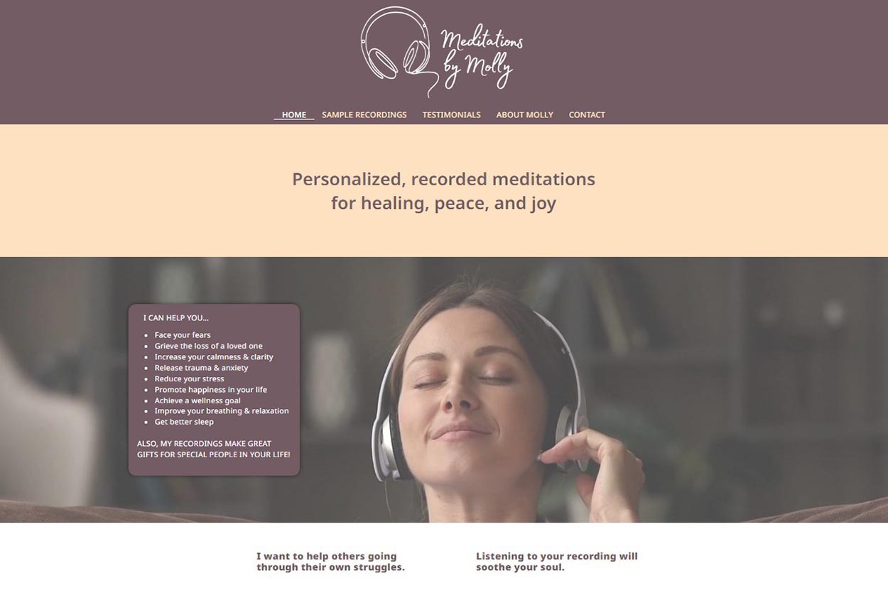
Last month, I was given the opportunity to redesign one of my clients’ websites. I had designed her original website over three years ago, and it was one of the first websites that I made after starting my own website design business. My client, Meditations by Molly, had also changed her brand’s focus. Three years ago, she had two things that she was focusing on. But we talked the idea over, and I convinced her to focus on one or the other for her website. She chose to focus on her customized meditation recordings. I made her a new logo and then got to work on the site. Visit www.meditationsbymolly.com to see what I came up with.
Here is the home page of the old site. It was very text-heavy and hard for people to skim and look over quickly.

Below is the home page of her new site. She still wanted to stick with the same colors, but we added a new logo at the top and a simple photograph of a woman listening with headphones. I also put in more white space.

After redesigning Molly’s site, I became curious. How do you know when it is time to think about redesigning your website? After searching around the internet, I found out that the general consensus is that you should change up your website about every 2 to 4 years. However, that is not always the case. Below are a few questions to ask yourself to help you tell if it’s time to redesign.
First off…
Are you embarrassed by your current website?
The easiest way to know if you need a total website redesign is if you’re ashamed of your current website. When it comes up, do you go, “Oh, yeah, I’ve been meaning to do something about that,” and sort of shove it under the rug with your toe?” If so, your website’s design is probably out-of-date. Web design trends evolve over the years. As time goes on, what was popular in the past loses its appeal. Look for signs such as clunky navigation, overly flashy graphics, or an overall aesthetic that feels stale. One trick to use if you think your site might look really old but you’re not sure, ask a kid. Kids know these things.
Does your website use a fixed-width layout?

Above is a screen capture of a client’s old website that was designed in the early 2000s before I came on board. It had a fixed width because its content didn’t stretch to fill the width of the screen. This case is a clear example of a site that is not aesthetically pleasing, is text-heavy, and can’t be viewed on a phone or a tablet. When this website was active and you were viewing it on a phone, you had to zoom in with your fingers to be able to read it or click on any links. (As a side note, I used a website called Wayback Machine (web.archive.org) to find this image above of Search North America’s old website. If you’ve never visited the WayBack Machine site, it’s fun to see what the current popular websites, like Google, YouTube, and Amazon, looked like in the 90s and early 2000s.)
Back before massive desktop displays, fixed-width websites were the norm. But desktop computer screens are huge now. I’m typing this out on a 30″ monitor at the moment. Websites look way better when they’re able to stretch and fill the width of the screen. If your site is still in boxed layout, consider a website redesign featuring full-width content.
Is your website mobile-friendly?
How does your current website look on a phone? Does it reformat nicely to display on small screens, or is it a total hassle to navigate? As I mentioned above, having a website that can change size and format for both big screens and small screens is super important. With the majority of internet traffic coming from mobile devices, having a responsive website is no longer optional—it’s essential. If your site doesn’t adapt well to different screen sizes or if the mobile version lacks functionality compared to the desktop version, it’s time to prioritize mobile optimization because you may be losing half of your visitors!
Did you change your brand? New logo? New business colors?
If you redesign your brand, redesign your site. Just do it. Don’t wait. Your regulars know you, but everyone else is most likely going to encounter your business for the first time through your website. Make sure you put your best foot forward across the board. Also, if your website is outdated for other reasons when it comes time to redesign your site, this will be a good time to consider redesigning your brand as well.
Is your website slow to load?
Here are a few statistics that I found on a website called Blue Corona…
- Once a web page loads, users form an opinion in .05 seconds.
- 47% of people expect a web page to load in 2 seconds or less.
- 39% of people will stop engaging with a website if images won’t load or take too long to load.
Users are becoming more and more involved with technology every day, and this has caused a need for instant gratification. They know that most sites are going to load quickly, so if they land on yours and it takes too long, they’ll just move on to the next. You want to make sure you can grab the user’s attention quickly and engage them before they have the urge to move on.
Once you have decided to have your website developer redesign your website, talk with them about adding features that will improve your site’s speed. Faster-loading pages are more likely to rank higher in search results and improve user satisfaction.
Is your website not ranking well in search engine results?
If your website is not ranking well in search engine results, it’s time to redesign it with SEO in mind. When a website designer does a refresh on your site, they can do research to identify relevant keywords and phrases that your target audience is likely to search for in search engines like Google. They can then include your target keywords in the title tags of your web pages, the body copy, and the naming of images.
New high-quality content can also help. Developing informative, engaging, and valuable content that addresses the needs and interests of your target audience is key to good SEO. When you add pages or change your content, the search engines know this and will rank your site higher. New, higher-quality content creates a very positive snowball effect as it improves the overall user experience, which, in turn, improves your site’s SEO.
Some other questions you could ask yourself…
Does your site still work? I mean, literally, is it functional?
Does it have a poor user interface?
Does your competitor have a better site?
Have your business goals changed?
Have you updated the content in the past year? The past five years?
Keep all these things in mind, and you’re sure to stay at the head of the pack. At the end of the day, your website is a huge part of your brand … probably bigger than you’re willing to admit. What really matters to the user? In the most basic sense, a user wants a website that loads quickly, is easy to navigate, contains the information they need, and has an engaging design. So, look into budgeting for a redesign if you see any of these red flags outlined above. The return on investment will be worth it. A well-designed website increases your online presence and generates more leads and sales.


